-
Apexlink
Real Estate
-
DLS
General Insurance
-
DMV
Government
-
Entiger
Fintech
-
GIS Mapping

Gas & Petroleum
-
HMS
Employee Benefit
-
HAWA
Government
-
Harley
Community
-
IHG
Hotel & Tourism
-
Sparkseeker
Humane Tech
-
Track Ninja
Sports
-
Response Vision
Disaster Management
- Artificial Intelligence
- Application Services
- Automation Services
- Cyber Security
- Chatbot Experts
- Data Analysis
- Data Warehouse Services
- Digital Commerce Services
- Digital Transformation
- Infrastructure Service
- IT Support
- IT Consulting
- IT Outsourcing
- IOS Development
- Android Development
-
Cross Platform Development
-
Gaming App Development


 Artificial Intelligence
 Blockchain
 Cloud Computing
 Infrastructure
Services
Infrastructure
Services Metaverse
 QA
Automation
QA
Automation UI/UX
UI/UX


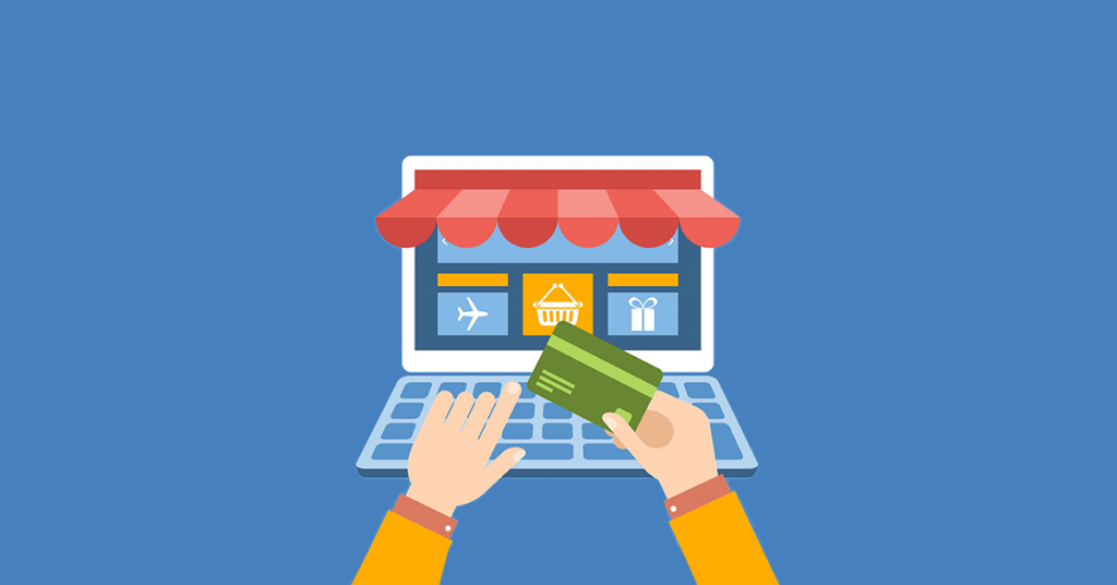
Do you know seven out of ten customers leave the checkout page without buying anything? While the first impression is crucial; it’s your chance to encourage the visitor to browse your site and buy, and for making the purchase, the eCommerce checkout page optimization is equally important. What’s the point of allowing your visitors to put products in the cart if they are not able to complete the checkout because of some issue in the checkout page?
You work hard to drive customers to your site. A good volume of traffic to your site is great, but only traffic doesn’t help to generate sales.
High Traffic + Low Sales = No Revenue
Let’s see some of the reasons that force buyers to abandon the checkout page:
• A complicated and lengthy checkout process
• The site fails to gain the trust of customers; they are reluctant to share their credit card information eco
• The Lack of enough payment methods
• The site crashes frequently
• No up-front visibility of the total order cost.
A report from salesforce highlighted that 84% of customers say, “The experience a company provides, is as important as its products or services.”
To make sales, customers should be provided with a seamless checkout experience. Read on to know what you can do to make the best checkout experience more fruitful.
What is termed as a Good eCommerce Checkout Page?
A good checkout page is the one that provides an easy and smooth transaction from the beginning to the end. The journey from the start to the end shouldn’t feel like a chore to the customer.
A good eCommerce checkout page reduces the efforts as well as the time it takes to complete the process. You don’t wish to disappoint your customers in the final stage on eCommerce platforms. Many users are impulse buyers, by providing them with a good checkout page you increase the chance of making a sale.
What Does The Typical Checkout Process Look Like?
A checkout page includes some specific steps that a consumer must take to complete his eCommerce purchase. On the checkout page, the user finalizes his choice about the product, adds or subtracts the number of items he wants, confirms shipping, and provides the payment. When the visitor stops following that path, it results in the failure for you; it means the visitor didn’t convert into a customer.
Here, we are providing some tips that will help you in eCommerce Checkout page optimization, and you will see a significant reduction in the rates of cart abandonment.
Capture The User’s Email Address Early
It is true that you are not going to convert users every time they reach the best checkout pages. Practically speaking, 100% conversion is not possible. So, one thing that you should always do is capture the email address of the user early. It should be an independent first step. As soon as a user enters your site, the first requirement for them should be to enter their email address and ask them to choose whether they want to check out as a guest or they want to create an account. The step is also to perform a lookup to tell if the email address already has an account associated with it.
The objective of acquiring the email address is to get in touch with the user in case of cart abandonment. Without the email address, you can’t launch your cart abandonment campaign. Abandoned cart email series brings back 15% of customers, who add an item to the cart, go to the checkout page, and then decide not to purchase.
Single Page Checkout
Does your site have separate pages to go through for reviewing the cart, entering the shipping address, selecting the payment method, and then making the payment? If yes, it needs to change. Customers prefer a single page best checkout process. Consolidate all the required steps on a single page so that the customer can complete steps conveniently in one or two clicks. You can achieve your goal of low cart abandonment by choosing single page checkout on your site.
Minimize the Header and Footer
You need to prevent any distractions on the checkout page; it is best to remove the core header and footer navigation of the store. The user should have his full focus on the checkout page. You can swap the header for the delivery information link, which should open within a lightbox. Trust signals such as “secure payment gateway” are a great way to build the trust of the user; you can use it in the header or footer.
Keep the Process Quick and Simple
When it comes to the checkout page, keep the process as simple as possible. Summarize what’s there in the cart and provide the options to make changes to the order; for example, the user has added a water bottle, and he wants to add one more at the checkout page, your checkout page should be as such that the user can change the number of bottles in the cart from the checkout page only. The user should not have to go all the way back to the product page to add two of the same products.
Also, include only those fields on the checkout page that are absolutely necessary. Don’t force your visitor to fill out unnecessary information as the chances are that the user might lose interest in buying the product from your site. If the next step includes choosing a payment method, then it should be self-explanatory to the user. The user shouldn’t face any difficulty in determining what information needs to be filled where.
Promote Membership Subscriptions
When you promote membership subscriptions, the order placement probabilities escalate. Take the example of “Amazon Prime”; people who subscribe to Amazon Prime get free one-day shipping; meaning they get the product delivered on the same day, and there are no delivery charges. It is a great way to attract customers. That’s why your checkout page should include an option to subscribe to such memberships. It’s a great way to increase the order placement opportunities, and businesses make money from subscriptions.
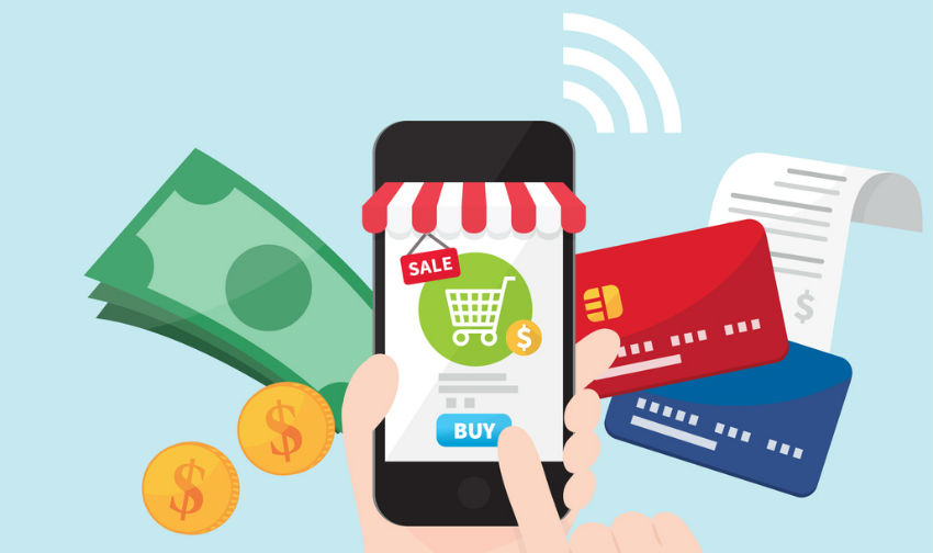
Multiple Payment Options
It is important to embed all the popular payment options to ensure that your customers complete their purchase. Never forget the latest options, such as Apple Pay. Apple Pay is supported on the iPhone, iPad, Apple Watch, and Mac.
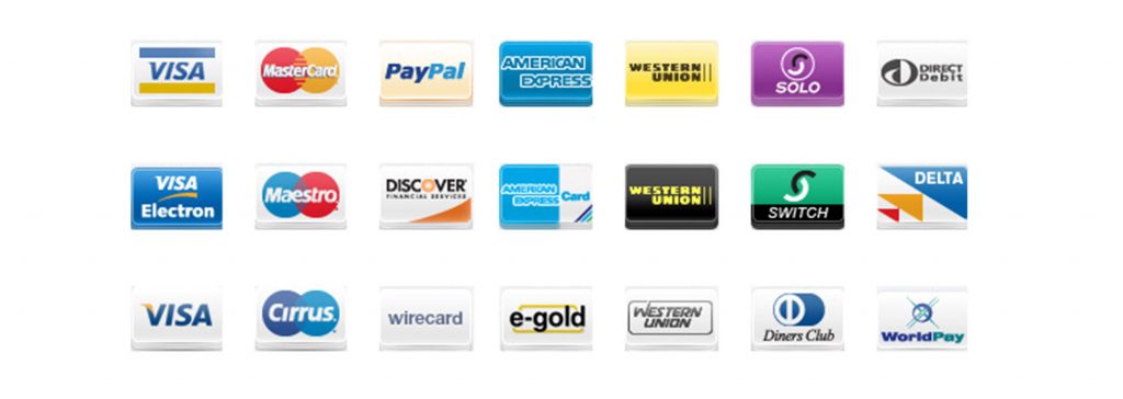
Keep the option of Cash or card on delivery, credit or debit card payment, and payment from the wallet (such as PayPal wallet). Customers can choose the option that they prefer.
Display Trust Signals
Trust signals are crucial throughout the checkout process. When users reach the most sensitive part on the webpage, they think about security. When users reach the point where they have to fill their debit or credit card details, they feel a little reluctant. To assure users that the process is safe, you should display trust seals; you can show merchant reviews, SSL certificate, logos of payment options available on your site.
Streamlined Domain Experience
Another important step that retailers can take to establish trust and increase conversions at the checkout page is by keeping customers on their domain throughout the whole shopping experience. There are retail sites that take the user to a third-party checkout provider; however, this is not a good practice as it can cause distrust. Keep the customer on your own domain.
Optimize Checkout Page Load Speed
Ideally, users shouldn’t have to wait for more than two seconds to submit their checkout form. 79% of customers who face a problem with the checkout page load speed say they won’t return to the site to buy again. These numbers don’t include those who abandoned their carts and never completed the purchase. Therefore optimizing page load time adds to the better user experience and increases the eCommerce revenue.
Improve Mobile User Experience
To ensure that shoppers who complete the sale with their smartphones have a pleasant experience a responsive design should be the priority. Responsive design adjusts to any screen size automatically. Out of all the eCommerce transactions, smartphones contribute to 50% of them.
If you haven’t optimized the website for mobile users, it’s time to focus on eCommerce Checkout Page optimization right away and improve the user's experience. In fact, you can even consult an e-commerce web development agency to optimize your checkout page with a smarter approach.
Default to the Cheapest Shipping Option
When a site offers free shipping, it results in increased online sales. 86% of respondents who abandon the cart said their primary reason was the cost of the shipping. If you need to charge for the shipping, then default to the popular and cheapest option. These changes ensure a positive eCommerce checkout best practices.
Make the Checkout Buttons Visible
Customers should be able to find checkout buttons easily. It is best to add checkout buttons at the top as well as the bottom of the page. Making the checkout buttons easily visible encourages users to take action.
Final Words
Ecommerce checkout page optimization is essential to retain customers and increase revenue. A small error in the checkout page can result in losing customers. Get feedback from customers on the user experience and identify the areas which need improvement.
Planning to develop an e-commerce website? Check out the best e-commerce platforms that are practiced by the major industry leaders.
Howdy, Seasia Infotech